Microwave Redesign
Reimagining the “magic oven” interface

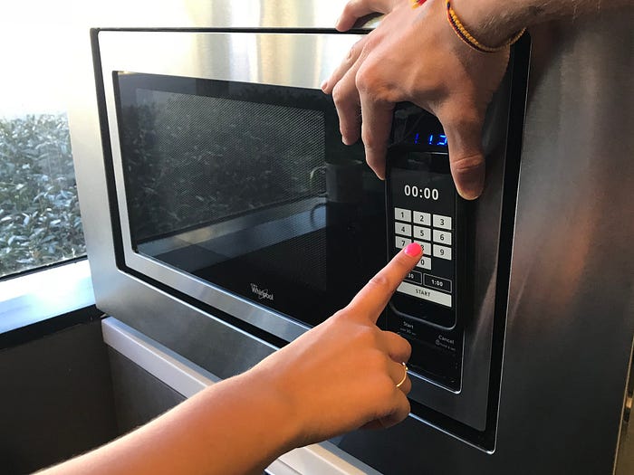
The microwave I use at home was given to me and my partner by his youngest sister, who used it in college. It’s a Magic Chef 0.7-cubic-foot countertop microwave. Simply put, it’s nothing fancy. It heats our leftovers, an occasional bag of popcorn, and the cup of coffee I forgot to drink. Though the worn-out “Start” button gives it some added charm, I have no affection for it. We have a kitchen, so we needed a microwave.
The first countertop microwave oven was sold in 1967 for $495. Expensive, yes, but it was the latest iteration of a once-750-pound device sold in 1946 for $5,000. By the mid 1980s, microwaves could be found in 25% of U.S. households, quickly rising to 90% in 1997.
Though convenient, the “science oven” (as described in the 1970s-set film “American Hustle”) is not the most intuitive of devices. As a UX designer, I’ve often found it amusing that most microwave owners I’ve spoken to accept the subpar usability of these appliances. So, in honor of its 50th anniversary, I thought it would be a great project to redesign the microwave interface.

PROJECT CONTEXT: Fun side project 😇
TOOLS: Pencil, paper, Post-its, Google Forms, Sketch, InVision
DELIVERABLES: Research insights, interface mockups, InVision prototype
MY ROLE: UX / UI Designer, Researcher
The Challenge: Questioning Complacency
Of all the familiar home devices, it seems the microwave has always been the one lagging in usability. Most people I’ve spoken with can relate to only using a fraction of the 30+ buttons on their personal microwave. While other appliances have become more intuitive, smarter, and elegant, the microwave continues to disappoint. Why is that?
I believe this is due to the underlying essence of the microwave: its convenience. People use microwaves to quickly heat things. After a few cumbersome interactions, a user can usually accomplish this.
“I like how simple it is.”
“It’s basic. Nothing spectacular.”
“I’m used to it. Other than that I hate everything about it.”
Rather than purchase a new microwave (that’s easier to use), most people just live with the one they have. People are creatures of habit, and tolerating these interactions, though sometimes comedically unintuitive, is worth the money saved.

The apathy users feel towards their microwaves may never fade. But what if people could immediately become experts of an unfamiliar microwave? What if they could use it every time and leave satisfied? What if they could, dare I say, enjoy using it? What would such a microwave look like? As a designer of experiences, this was a challenge I was very excited to take on.
Defining the Key Pain Points
In order to understand the extent of this usability problem, I needed to learn how people actually use their microwaves and how they feel about them. With careful consideration, I built a survey using Google Forms and iterated on the series of questions based on feedback from several colleagues. The final survey had 30 questions, which consisted of multiple choice, multi-select, and free text entry.
I collected data from 72 survey respondents over three weeks. Additionally, I interviewed three participants whom I asked relatively open-ended questions about the relationship with their microwave; what they like, what they don’t like, and what (if anything) they wish they could change.

Free text responses from the survey and quotes from my interviews were written on Post-its and compiled into an affinity map on a wall in my apartment. Aside from acting as a great conversation starter for guests, it led me to uncover some very interesting insights based on common themes.

Feedback analysis helped me focus my design direction and I targeted interface issues related to button prioritization and feedback. I quickly realized that many problems would be out of scope–awkward bulkiness, cleaning difficulty, and heating inconsistencies were not problems related to the interface, but rather the hardware itself.

Wireframing
I jumped into design with clear direction and focused on the four main screens of this new microwave interface: the resting state, time entry, in-process countdown, and completion. Rather than the static analog interface most microwaves feature today, a fluid touch screen can make much better use of screen space and show appropriate actions and feedback when relevant.

Usability Testing
This is where the fun begins. I love how a quick prototype can be used to validate a simple hypothesis or design approach. Though I myself use a microwave, I do not represent all users. Assumptions, beliefs, and standards are all put to the test when observing someone else interact with a design.
I was very excited to start usability testing with my first-iteration microwave screens. InVision is a great companion to Sketch and helped me get a prototype to my phone within minutes. Placing my phone on a microwave, I ran two participants through three scenarios during usability testing: (1) cook a Hot Pocket for a time of your choosing, (2) heat a cup of water for five minutes, and (3) start a timer for two minutes.
I encouraged participants to have an open mind and think out loud when working through their assigned scenarios. Testing provided valuable feedback related to time entry efficiency, toggling between timer and cook functions, and resting state display. With this feedback I iterated on my design.


Going Further
Though the interface is an important element in the user’s interaction with the product, every touch point must be addressed to create the best experience in a holistic sense. This project only addressed the interface, but I would be very interested to investigate hardware design in order to complement the input and feedback elements. Device size, door usability, spinner plate functionality, and interior cleaning could all use their own analysis.
Further research is also needed to explore other digital products that focus on timed countdown interaction and display. For example, after using the new Apple Watch’s timer, I started to reconsider the number pad entirely. The small interface simply presents whole numbers that initiate a countdown after a single tap. While this is convenient for on-the-go use, microwave users sometimes enter time that’s less than a minute (e.g. 5 seconds, 10 seconds, etc.). Therefore, this requirement necessitated some kind of number pad.
Finally, I would love to pursue a deeper dive into microwave cooking presets. What are the most common? Are they standardized across devices? How many people use them regularly? I imagine that taking an inventory of cooking presets across brands, models, and uses would be enlightening (not to mention fun).

I was inspired to do this project in part after reading about Breville’s brilliant “A Bit More” button created by industrial designer Keith Hensel. That button was the kind of simple user-centered solution I wanted to achieve with this microwave redesign. Empathizing with users and identifying core problems often result in the most elegant and delightful products.
Thanks for reading! If you enjoyed it, please take the time to 👏👏👏. Any questions or comments are welcome below. You can find this case study and a couple others in my portfolio at www.joemoe.win.